This was my first time attending the Biennial at the Whitney. I have to say that I really enjoyed it and can not wait for the next one. I came accross a lot of interesting art during my stay. perhaps my favorite artist was Storm Tharp.
http://www.whitney.org/Exhibitions/2010Biennial/StormTharp - I really enjoyed the use of ink in these pieces. I have worked with ink before and I commend Tharp on how awesome these came out. I also really liked how the artist left their swatches on the border rather than cropping it out when framing.
http://www.whitney.org/Exhibitions/2010Biennial/TaubaAuerbach - This artists pieces had me awe struck for quite some time. It took me a good 5-10 minutes to decide whether or not it was actually a piece of fabric folded, unfolded, then framed. In reality it was just painted extremely accurately to portray the depth of a wrinkled from being folded, fabric.
http://www.whitney.org/Exhibitions/2010Biennial/JimLutes - This artist for some reason reminded me of Cailin. I think maybe the tremendous amount of cohesion between the colors in his paintings is what reminded me of Cailin. I have always thought that Cailin has a great sense of color harmony.
http://www.whitney.org/Exhibitions/2010Biennial/AurelSchmidt - I think what captivated me most about this arist was their use of a wide range of media. One piece in particular had flies, condoms, cigarette butts, and even blood.
http://www.whitney.org/Exhibitions/2010Biennial/PaeWhite - When I saw this piece I could not decide if I actually liked it or not. I have now decided that I really like it. White captures the simplicity of smoke with the complexity of a woven tapestry.
At the end of the day, this exhibit brought more to the table for me than I really thought it would.
Prior to the Biennial, I went to MOMA. Never being there before I was naturally awed when I saw such masters as Dali, Picasso, and even Van Gogh. Although I did enjoy viewing the previous, I really took to seeing Wyeth's "Christina's World". I have always loved this painting and the story behind it. I spent a good 10 minutes just staring at this painting, trying to take it all in. While at MOMA I also got the chance to see Tim Burtons exhibit. Amazing. That is the only word I really have to describe his work.
Sunday, May 9, 2010
Jasmine Lea Hoskins-Thesis Paper

I began this semester in a routinely fashion of warming myself up artistically with some large acrylic paintings. I had purchased a large quantity of acrylic paint and planned to take full advantage of the supply.
Some of my original expectations were to create large collage murals spreading out onto the wall in an organic form. I did make some of those pieces but found that the projects size overwhelmed. The simple question came to mind “what will I do with it after the class is over?” I think that is what affected me the most during this semester. I do not have a studio at this time. Having my art crammed into my bedroom transforms my room into mind clutter. I have one room to live in at this time, I needed to keep that in consideration and make work that suited the space I have available to keep it in. With that in mind I focused on projects that were compact. Over the course of the semester I realized an art form that captured a life long vision. My memories of certain childhood tactile experiences surfaced during the course of the semester and for that this semester has been a success.
My proposal initially responded to the spiritual journey of past and present experiences. I am still working on my salt lick sculpture of Buddha. I currently have a number of projects in process. My intended body of work for the semester allowed me to explore myself from within. I would call my activity an internal retreat. I desire to explore myself enough to open up to the world and create universal art. I want to work through the internal that blocks the sun. I want to expose my most memorable experiences and interweave them with issues that a larger audience will respond to. I am no longer satisfied with dealing with "my" issues. During the course of this semester I changed. The conversations I had, the art I was making came together. This merging was stepping stone in my growth.
I feel incredibly satisfied with these recent pieces. I feel that I have come to a pinnacle in my work and my life. In these past 2 years that I have spent at NCC I have undergone 7 medical procedures. I have sense that the use of metal during the times of these operations has left quite an impression on me, no pun intended. I have been responding to the tools, the mirrors, the lights, tables etc. The sterile clean nature of my recent work parallels my experience in the hospital and doctors office.
I have had a turning point in my material this semester. I began banging out metal pieces that have an assortment of magnet pieces that are interchangeable on each of the four pieces. I am shocked by the lack of painting I did but so grateful that I had this turn of materials. My satisfaction has heightened within the making of these steel landscapes. I see my steel pyramids as close-ups, details of a bigger picture. Same as the thread pieces, I see them as close-ups of threads of a fabric of a universal life. I believe my trip to the Navajo Nation has affected me greatly and I want to express that. The colors, shapes and space of the West activate my heart. I feel a pulse like no other out there. I think that the use of steel this semester has affected me similarly. I have sparked a new beginning, a new view. I see a magnetic horizon. The form and color magnetically connected.
I am not sure exactly what comments came to my aid during the semester. I did not hear much from the others students regarding my work. I was told by a couple of them that they liked it but other than that we did not really talk about it. I have not heard anything this semester that I have not heard before. I have had discussions with Tom Burke that opened me up greatly during my Drawing 2 class. He was talking about perspective and I realized something during his explanation that I am so grateful for. I thanked him dearly and we are closer because of that. Bruce Wall an d I have had some discussions that exposed both of our personalities as artists.
I could see the querky excitement in Bruce's eyes when he looked at something that he liked. That inspired me.
I had written a 6-page paper exposing the Huichol Tribe of Mexico. Indigenous life styles, dwellings and people have intrigued me for many years. I see the details of their necessities and fall hard for the raw materials and décor. I have also been a lover of Richard Diebenkorn’s work ever since I began painting. I feel I am trying to capture my love of his sense of color thru the use of the magnets on my steel pieces. His color choices are so clear and confident I can only wish to be remotely that clever and wise. I think with the magnet pieces I am pointing out how important color and form are to my thinking. In these pieces I can think of nothing else.
I was not able to meet with any of the professionals in New York this semester. I have been having conversations with Bruce Wall and other teachers that have been a source of encouragement and knowledge. I have observed my teachers in action and seen the satisfactions and frustrations of teaching others. I see the balancing act that it takes to learn and lead by example. I had hard times in the studio with the other students, being that I am older and more interested in quiet while I work. I was coming back into the studio for the first time from a long vacation. I was scared and unsure what I was going to feel like working around others. I had a hard time with sound and space so I would retreat into the other room just to feel some peace. I think it is the age that I am at in life. I don’t have the tolerance for the age difference when I am working.
I do not have a copy of my artist’s statement. I have to type it in tomorrow. It is hanging up in the gallery/hallway. I cannot find it on my desktop. I wrote two statements and a poem that describes the sensations of looking and making the artwork.
Banana Factory
The internship at the Banana Factory was mainly consumed with labor. Painting,cleaning,etc...
I think they were preparing for an opening that day and were absorbed in the activities of that.
I think they were preparing for an opening that day and were absorbed in the activities of that.
Saturday, May 8, 2010
New York Trip #2- Liz R
 A really neat bronze type sculpture near what seemed to be apartments.
Whitney
The last exhibit that we saw was the Whitney Biannual. I was more impressed with this than I was the Guggenheim. We were instructed to write down at least 5 pieces/artists that we found interesting. I wrote my list in my sketchbook, which is currently locked up in a glass case in communications hall, so I can't refer to it directly but I looked on the Whitney website and found some of what I remember writing down.
1. The Butcher and his Wife by George Condo
I really liked this giant bronze sculpture. I thought it had a lot of emotion.
2. All works by Charles Ray
I thought is use of color was very eye catching, although works seemed somewhat juvenile.
3. Self Immolation in Afghanistan: A Cry for Help by Stephanie Sinclair
These shocking collection of photographs were very powerful, which I find an important aspect in art.
4. Smoke Knows by Pae White
5. I don't remember the name of the pieces or artist, but the gigantic piece that was right in the opening of the 2nd or 3rd floor was extremely impressive. It was made of different textiles and what seemed like some kind of molded plastic. They were two separate pieces but seemed as though they were meant to go together.
Guggenheim
The second museum that we went to was the Guggenheim. I had never been there before, and wasn't too impresses with the work being displayed.

This was a photograph by Joan Jonas.
The first museum me and Cailin went to was the Met.

They had an aboriginal exhibition going on. This is just one of the many pieces they had displayed. It is a decorative head dress worn by a south american tribe.

Maude Adams as Joan of Arc by Alphonse Mucha. I think this was my absolute favorite thing I saw on the trip. I love Mucha and was very excited to see one of his pieces in person.

This was a wooden carving of Bodhisattva Manjushri. There were at least 4-5 wooden carvings of different bodhisattva's (which are influential "enlightened" people).
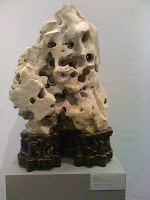
This was an amazing rock sculpture.
Thursday, May 6, 2010
Jenny Holzer Truisms - HC
1. The most interesting thing I found about this work by Jenny Holzer was her talent with words. I was not a big fan of the marble benches but I did enjoy the truisms. I just found the benches a bit odd. I feel like her words deserved a better place.
2. I would describe this work as original. Not many people are able to just turn simple phrases into an art form that others will enjoy. Anyone can just write down some words, but it really takes dedication to make the words convey a true message to the readers.
3.
A man can't know what it is to be a mother. - Those who can not bare a child, will never know what it means to be a mother.
Confusing yourself is a way to stay honest. - Honesty is best when blind-sighted.
Dying should be as easy as falling off a log. - Giving life is acceptable, so why is the choice to die not.
Even your family can betray you. - Although they are your kin, they may not always be kind.
Everyone's work is equally important. - Every act performed is important, no matter the size.
Wednesday, May 5, 2010
Thesis paper Miranda
In the beginning I did not expect much when I entered the class. The only expectations for this class were that I was going to be able to work on whatever ideas that I had then I would be able to show case my work at the end of the semester. In the beginning on the class I did want to work on Icons and Feminism but as I started to work I went with the flow and ended up on religion. I know that I will go back to the many ideas that I had for my icons and feminism, but I am glad that I worked with religion. I realized when I paint what I want that is usually a form of therapy for me; a way to verbalize what I am feeling and thinking about one subject, one day, or the past few months. I came to the realization that I don’t make art for other people not for them to learn form to be shocked, or to love/hate I make in for myself. Hoping that when people see it that they will understand what I was feeling when making and too see the point that I was making. I know that I will regret some of the things that I paint, say or do because my opinions might change or be altered, but, will never apologize for what I was feeling and thinking at that moment in time. With the way I get my ideas for my work I will always have an abundance of ideas. A person’s emotions, ideals, ethics, morals etc. only change and grow; they never go away so I will always have that to work with.
This class has helped me start to cope with not being a traditional art; meaning an artist that paints and draws. I have heard from more than one person “Ooo, this is what you do… I thought you were a painter?” I started to doubt my artistic ability, to doubt my ideas and the way I executed them. But, I continued to follow through with what felt right starting with my self portrait. Myself portrait when I made it, it was exactly how I in visualized it. After changing it I lost a bit of the personal connection I had with it. This is important to me to have a personal connection to my piece. When I make something that I really want to create it is like the idea is the consummation, the planning is the trimesters of the pregnancy and the creation/final piece is the birth. I have I guess a weird connection with the art I want to make then the art that I am told to make. With my creations it is like having a string extending from the center of me being to the piece and when I change something unwillingly it like that string has been cut and there is a numbing emptiness that, that piece of art is no longer mine and so I have no connection or love for it. With work that I was told to make I don’t really consider it mine though I know that I made it but the idea, still life or whatever was not from me, so I consider it someone else’s artwork (no connection).
My self portrait was like me standing up on a stage totally naked and reading out a book of my deepest thought and my most hidden secrets. I have had the weight on my syndrome for such a long on my mind that is was suffocating me. When I made it helped me cope and tell everyone though not verbally. Therapy that is what this work was. I loved using the found objects like the light bulbs, tubes and egg shells. I plan to use all them again.
My belief painting I knew right away what I wanted to do. When a person says belief I instantly think of religion. Religion is so very important to be. It seems to be the key to every person, every war, every law and every belief all lased with Religion. I respect anyone immensely who believes in anything. I know that I can’t as of right now there are too many problems that have to be worked out for me to be able to try to believe. It’s all so frustrating like mind boggling. So, I did my belief on my thoughts. The thought/feeling of smoother, controlled and even raped by religion/law. They both work hand in hand not only in the USA and it seems like in the world. Which I think shouldn’t be. But, I focused on the USA and how we are supposed to have separation of church and state which we don’t have. I just wanted paint and illustrate that both the Bible and the USA Bill of Right, Constitution etc. were all written by White upper to upper middle class men. When righting these words to be followed I highly doubt that they have everyone in mind. I doubt they had the poor, Hispanics, Women, Asians, Homosexuals, Africans, Americans of African descent, Italians etc. in mind when writing the law in the bible and our most cherished govern documents that we are now supposed to devotedly follow and believe in. I don’t think we as a people should praise and teach any of the hate and prejudice that is given off from any of them. I do think that there are good ideas that should be followed just because a person wants to be a good human being but, there are some things that just breeds hate.
Using my believe system as a cliff, I started to run then jumped. I looked into things such as the massive amount of priests that raped people. Thought of how rotten religion has gotten and how it at one point was probably meant to be pure and forgiving but now leaves a tainted and poison like affect on everyone who has been introduced to it.
In both my portrait and in my Belief system I used found objects such as egg shell and tubes. I will continue to use both in my future works. Both the eggshells and the tubes were to find, use and inexpensive to buy. I have always like doing 3D and instillation so; I know that I will continue with it. This semester I worked with manipulating different materials to fit my needs, which I know will be useful in the future.
There really hasn’t been anything this semester in critiques of my work that really stuck out to me. I know that I really need to work on expressing myself better and more professionally.
I have researched the Feminist Art Movement with Artist such as Judi Chicago who created the well known “Dinner Party” and also one of my favorites “The Linen Closet”. Another “feminist” artist that I have liked for years is Artemisia Gentileschi. I also have begun to research feminist artist Jennifer Linton, Nancy Spero and Faith Ringgold. I needed to look to see different artist just to know more artist and see different styles. I have a difficult time looking at other artists work not because I don’t like it or that I think that I am more talented. It is because I want my ideas for paintings, instillations or sculptures to be as pure as possible. Pure meaning from my mind, my emotions, my experience; I don’t want to look at someone else’s creation and rob it. I fear copying.
I have learned a tremendous amount on knowledge form the people we have met. Starting with Emil he taught me as an artist you have to take risks and use different types of materials. He opened my eyes so that I can see the usefulness in everything. I have learned a great deal this semester. I know that it is hard work being an artist and that fame and fortune will not happen overnight. It is a tossup between Emil Lucas and Don Voisone. Don made me realize that art school or school in general is not for me. But, he made me want to work even harder to stay in school because he thought art school was not for me and I do love a challenge. Emil did an amazing thing by telling us about how he creates some of his work with Fly larva. He really is saving me time and money. By just making me realize that everything is at my disposal. This in the long is more helpful than me realizing that art school is not for me.
My artwork is just my thoughts put out in 2D and 3D, making them tangible. Making my thought real eases me through life. When they are out of my head and can be seen in front of me I gone through the therapy needed to get me over the hump and on my way to be resolved.
For the pieces that are on display my artist statement is the feeling with which a person regards anything considered mean, vile, or worthless; disdain; scorn. Contempt, which is everything that I felt from the beginning when I thought of my belief to the middle when I was trying to let people know what I was thinking and what I will feel when I hear what people think of my thoughts.
Kylie Sandt - Thesis Paper
In the beginning of this course I had initially expected to work mostly in illustrating Greek mythological stories. However, as I thought more about myself as an artist at the time when I was writing my proposal, I realized just how bored I would be simply painting out specific scenes. So I had come up with the idea to create a Science Fiction/Fantasy world installation. Right from the beginning I started to move away from the ideas in my proposal. My first piece was a sculpture made of mud and I received some great feedback on my materials. I kept saying that I was done with mud, but I ended up turning to sculpture, using mud as my primary medium. With each mud piece I got better at making the mud solid and sturdy. When I did my Navajo piece I experimented with bees wax and really liked the result. From there I knew I wanted to use bees wax in my future work. As I thought about the possibilities of bees wax a vision for my final piece began to develop. Unfortunately, by the time I started the project I no longer had the bees wax available to me and decided to turn back to a mud-like material, clay, which is now a major part of my final piece.
“Laying Low” is the pile of mud with the eye balls staring out. It is meant to be my self portrait for my first piece for the course. I struggled a lot with the construction and the base and I feel that both the presentation of the concept and construction were not very successful. “Human Pentagram” I did for the personal belief project. It is an abstracted pentagram into a shape that resembles a human-like shape. For my “Navajo Inspired Self Portrait” I tried some new materials, slate and bees wax. I feel confident in the way the piece turned out, and it was an interesting experiment that made way for my later passion for the honey bee. “Poured From the Earth” is the piece I did for the “hand picked” show at Mercantile Home Gallery. I made a lot of progress with the stability of this piece in that the mud did not crumble away. I also used broken glass that I had found by creeks and rivers. I think the piece was meant to represent the our dependence on the earth. “Legend of the Bee” is the installation for our class show. I painted a few scenes from myths about the bee and hung them on a giant honey comb made out of clay that I gathered myself. The bee is an important part in the survival of human beings. Without them there would not be enough fruits and vegetables to feed ourselves and other animals. Since ancient times people have known this and cherished, even worshiped, the bee. With my love of mythology I wanted to illustrate some of the stories I found about the honey bee and honey. I liked the final result, but I wish I could have had a little more time to work on it when I was relaxed. I feel like it should have been grander than it was, but I was missing the time and the resources to make it happen. “What Have We Done?” is the installation I did for Media Art though it is not for this class I feel that it was an important project. It included a sculpture of a screaming mud man facing a projection of a scene of the earth being destroyed. The project got me working with video which is a medium totally different from anything I had formally done before. I stuck with my original medium of mud for the sculpture and I was really happy with the way it came out.
Throughout the semester I have worked with mud, bees wax, and clay. All three materials were new to me in the way I was using them. My first material was mud. It took me a while to figure out what to do to make it solid. I started with pure soil and stones from my back yard, when that didn't work I tried adding acrylic medium to it which worked a little better but it still crumbled, it was also very heavy. For “Poured From the Earth” I used window screen to create the shape and I poured my mud over it, adding more medium than before. This made it stronger and on top of that I put matte medium over that to keep it sealed a little better. This worked very well. Clay was another thing I ran into problems with. I had gathered it from a creek and wanted all of the stones and organic matter out of it. So I mixed it with water so all the stones would sink and all the plants would float, then separated them and let it sit. I wanted it to settle and become moldable again but it took far too long so I had to figure out another way to get it into honey comb shapes. I ended up cutting the shapes out of foam board and using the clay almost like a paint. Using these material has made me realize just how important earth is to me. And how much I like playing in the dirt.
If people had not been interested in my use of mud I probably would not have continued using it. At times I was frustrated with it and wanted to draw or paint instead because it was an obvious way to get the assignment done. I did not expect that Don Voisine would like my mud, but it turned out he was really interested in it. Peoples enthusiasm for my materials and my dislike for painting kept me with it.
The classic paintings of Greek/Roman mythology are always an inspiration to me, as well as mythology of all kinds. I researched all kinds of honey bee mythology for my installation. Andy Goldsworthy is one of my favorite artists, he is also a big inspiration to me. His closeness to the earth is far deeper than mine and it makes me feel bad that I had to use acrylic medium in my mud, but it's all part of finding my own place and my own style of art.
Our trips to visit art professionals this semester has just opened my eyes to the art world all together. Before this I did not really care about the art world let alone know what it was about. Meeting people who make or show art for a living opened my eyes to a much wider array of careers in the art field. I think Emil Lukas made the biggest impression on me. He's a local artist who lives rather close to me. I now believe that in the end I don't have to live in the city, but I do have to get out there and see as many places as I can. Don Voisine was another artist that left an impression. I think meeting professional artists personally was a lot more interesting because there were more connections that could be made instead of a very formal setting where they are giving a non-personal presentation or speech. However, I think the people how made the biggest impression on me were my classmates. Working so closely with people who were in the same position as me and seeing what kind of things they were doing gave me an insight into who I am as an artist and a person.
Artist Statement: Everything in the world is held in place by earth. It is that in combination with water that provides a foundation for all living things. It nurtures and provides for us. The honey bee is another very important factor in our survival. People throughout history have known this and told tales of the honey bee and the importance of that which it gives to us. I am fascinated by the connections between earth, man, and the bee. In my work I combine natural materials that I find around me with a “traditional” medium and create my own connection between them.
Tuesday, May 4, 2010
New York Trip #1
Claire Seidl
I was most impressed with Claire's photos, and one painting in particular. I liked the texture that she achieved in this painting, and I also liked the exposure techniques she used in her photography. I was extremely jealous of the dark room that she had. I've always wanted a
dark room of my own. I liked seeing the space that she worked in and hearing about her talk about her schooling and what it took to get her to where she is today. What I think I admired most was that it seemed like she is doing what she loves with art, that she is in exactly the direction that she wants to be in and is able to make a living off of doing what she's passionate about.
O.K. Harris Gallery
I really enjoyed this artist, Alejandro Quincoces, and the way that he painted realistically but put a kind of grainy foggy wash over everything to kind of mute out the painting.
Broken Kilometer
I thought the Broken Kilometer was absolutely amazing. When it was described to us, I didn't expect to be as impressed with it as I was, I thought it sounded kind of boring, but stepping into the room I was blown away by the presentation of all the bronze rods. I was genuinely impressed by this exhibition and wish I could have stayed there longer.
New York Earth Room
I wasn't as impressed by this as I was with the Broken Kilometer, but I thought it was amazing as well. I think my favorite part about it was walking up the stairs and starting to feel the moisture in the air and smell all the dirt before you even got to the floor that it was on. I also found it amazing that in the midst of the busy city, there is a small (compared to the rest of the city), quiet room filled with dirt on the second or third floor of some incognito building, and hundreds of people pass by it a day without even realizing what is there.
Jack Shainman Gallery
I thought the works displayed by El Anatsui were absolutely amazing. I was completely captivated by the fact that he was able to weave thousands of pieces of metal into an extremely textile looking piece. I was impressed by the size of the pieces and appreciated them because you could tell how meticulous and tedious all the pieces were.
Jonathan LeVine Gallery
I absolutely fell in love with the LeVine Gallery, especially this painting by Esao Andrews. It was extremely creepy, and I love creepy things. I read Juxtapoz magazine every once in a while, and they absolutely love the LeVine gallery, so i was familiar with the name right away. I really liked the type of art they had displayed there and thought it was the best part of our first New York trip. There were some other galleries in the same building that I wish we would have had time to look at.
The Independent
I wasn't completely excited about this collection. There were a few pieces that I thought were nice, but overall I didn't see anything that really made a lasting impression on me.
Pulse
I liked Pulse a lot, I was just so tired and worn out by this point in the trip that I almost felt like it was a chore to walk around and look at the art. There were a lot of artists that I really enjoyed. I thought the taxidermy animals constructed by Enrique Gomez de Molina were amazing. It was a very original and eye catching idea. There were multiple other animals displayed this way, but I really liked how he positioned bugs around this, tying the animal down with strings.
I had never been to such a large, modern show, showing so many different artists. I also was really excited to see one of Emil Lukas's string pieces hanging up there.
I tried to post pictures but it said my html was incorrect and I really don't feel like messing around with this computer. Sorry everyone.
Don Voision Crit- Liz Ronneberg
I was interested to meet Don, although I wasn't crazy about his art work, I always like meeting artists and talking to them about the thought process that they take when approaching their own works of art. I asked him about how he comes up with the colors for his paintings (since I have such a hard time with color association), and he explain to me that most of the time he'll see, on the side of the road or anywhere for that matter, colors that he notices look good together, and he'll try to mimic those in his paintings.
I showed him my self portrait, series of Mars surface drawings, a painting I did of a Dali figure put into a different background, and possibly the jellyfish painting that I did? He said he was impressed with my attention to detail and the fact that I like to blow up smaller sections of things to force you to look at them closer (I think this was more directed towards the Mars drawings). He was also interested in my use of cardboard and encouraged me to experiment with it as much as possible.
Banana Factory Internship- Liz Ronneberg
I went on my internship with Cailin and Chris. We didn't do much besides spackle/paint the walls and tape off areas where they're going to repaint the walls. It seems like most of the other people that went on the internship did essentially the same thing, and I'm wondering how much spackling really needs to be done in that place. I really wish that we could have done work that would have given us more of an insight on what it is to be an employe there rather than just do odd jobs that I think no one else wanted to. But I understand that interns usually get stuck with that kind of work.
When we went on the field trip to the Banana factory I was really impressed by the operation and overall atmosphere of the building. I was excited to intern there and fully intended to do more than the required hours. I'm not sure what deterred me from wanting to put in any more hours, but I don't have much intentions of doing that anymore.
Jenny Holzer Truisms/Allentown Art Museum
Jenny Holzer
1. a. What was the most interesting thing about this artwork? (medium, content, style, location, etc.)- I really had no interest in Holzer's work. I found it rather mundane and it's not something to I would recommend showing to people, or would even tell people that it existed. I also find it very ironic that they chose a court house to display truisms like "Boredom makes you do crazy things", probably why half the people are at the courthouse, and "Children are the hope of the future".
b. How would you describe this artwork and what are the ideas that the artist is working with?- I think her work is extremely unimpressive. There were hardly even any truisms that I found worth noting. I don't mean to be harsh, but I really think it was just blabber carved into fancy marble benches.
c. Select 5 truisms and rewrite them in your own words.
1. "Dreaming while awake is a frightening contradiction."- Dreaming while awake is called spacing out.
2. "Dying and coming back gives you considerable perspective."- Learn to appreciate life without having to almost die for the enlightenment.
3. "Drama often obscures the real issues."- People get wrapped up in things they shouldn't.
4. "Boredom makes you do crazy things."- People get bored.
5. "Children are the hope of the future."- I should have been a better parent.
Allentown Art Museum
A. What did you find to be the most interesting aspect of their job and their role within the museum?- I thought storing/restoring pieces would be interesting, being able to work in the areas of a museum that is never seen to the public. And as monotonous as it seems, I think I would like to be the person that cuts mat board, frames pieces, and makes labels and signs. I've always been a fan of tedious and meticulous work (possibly because it helps me to put my mind at ease), and that is something that although would bore many people, I might find fun.
B. Can you picture yourself in this type of position? If so, what do you like most about it?
1. Jacqueline Atkins- Chief Curator
a. Although this was one of the more appealing jobs that they mentioned available while working in a museum, I don't think my personality is fit to have to deal with the stress of the responsibilities of having to organize and keep tabs on all the work in the building.
b. I did like the organization and cataloguing aspects of her job. I have slight OCD tendencies when it comes to arranging and keeping things in order, and this would be a way of getting paid to do that.
2. Jane Kintzner- Interim Director of Education
a. I would never be able to picture myself in her job position, or in any museum position for that matter. It is just not the type of environment that I would want to work in.
b. Although, I do find the fact that she gets to interact with different artists, work directly with their pieces, and oversee's their displays from start to finish.
Edited Artist Statement
I rewrote my artist statement, let me know what you guys think.
In most of my pieces I try to convey the idea of contrast. I feel very strongly that to fully appreciate something, you must also experience its opposite, its most commonly known concept, yin and yang. In my self portrait (2) I set the exaggerated eye forward so that it differs from the background. This was also the first piece in which I started using cardboard. Without having the idea of contrast in mind when starting my triptych (4, 5, 6), it ended up symbolizing my belief that life can come from the death of something else. The four smaller pieces (1, 3, 7, 8) are made of string, which slightly shows a 3D contrast to the flat cardboard. Even the slightest difference is still a difference. Art to me is a way to visualize ideas that I would otherwise be unable to explain, a way to bring forward that which is sometimes hard to put into words. Like this whole paragraph.
HC thesis.
Early on this semester, I had every intention of working myself as hard as I could to turn myself into a great photorealist. Since I began painting a little over two years ago, I have had a huge fascination with realistic paintings. I have this mindset that if you are technically a good painter, such as having serious skills as a photorealist, I feel like you could paint whatever you could possibly want and get away with it because you have the skill set behind you. Throughout the semester I did follow this plan with the creation of my self portrait. For this portrait I painted a realistic black and white version of my face and hands on top of a black background, which I later encased in a wire to create an enclosed figure look. As time went by I realized that I had been spending too much time not working toward my final plan for the semester and there I was with not one painting ready for the final installation and only a month to complete it. This is when I realized I needed a new course of action. I needed a plan that made it realistically possible for me to complete enough work to cover a ten square foot area in the communication hall. It turned out in the end that I actually made more pieces than I needed. But I had a connection to every single one, and I could not bare to not show every single one.
This semester was very insane for me. Normally I like to be on top of things and get everything done so that I am not pressed for time. One thing after the other has been due this semester causing me to push one project back and so on which brought my level of stress to an all new high this semester. I had every intention of doing a very moody/emotional set of paintings for the installation, done to the best of my abilities in realism. Once time became a concern I changed my direction to something that I could finish in the amount of time I had. This is where plaid came into play. I had a sketch early on this semester where I just made a gradient and simply placed a layer of plaid on top. I really liked how this looked but never really thought it would stand on its own as it did not really have much to it. After a short meeting with Bruce Wall, we came up with what I like to believe is one of the most original things I have done. I decided to incorporate my love of realism into my love of plaid. Bruce called these paintings “Plaid World.” While I really liked that idea, I also wanted to venture into some other things to show more of myself as a person. I am quirky, I love patterns, I love many things people see as trivial or just plain tacky. I take pride in being an individual with my taste in pretty much everything around me.
I am a huge fan of rubber ducks. After a little consideration, I decided, “Hey, why not make a few paintings of some rubber ducks?” A few people that saw these pieces in progress did not really get them or like them. While I do care what others think, I also want to make myself happy. This is why I completed five pieces of various angles of rubber ducks. I fell in love with them. One piece in particular I plan on hanging in my living room following the show, whether my mom agrees to this or not. I actually would like to make many more duck paintings. I even thought that maybe this summer I would create a few pieces designed after real ducks, rather than just rubber ducks.
Another direction I took this semester for the installation was my fondness of fruit. Everyone likes fruit, I like painting fruit. So why not make a few fruit paintings? Two weeks later I have a set of five fruit paintings which I placed on a picnic stylized pattern whose colors compliment the color of the fruit. This set I found had a completely different effect on the people who got to see them in progress. Numerous people offered to buy them for their kitchens, which I was very flattered by. The final set I made for the installation was a series of body figures inside plaid. I did so by creating a nice gradient on the surface of the canvas which would become the background of my pieces. I then made one layer of stripes for the plaid. Following this, I painted the realistic figures and then topped it off with one more layer of stripes to give the piece an overall feel of plaid.
One thing that I actually recently discovered through Amber were stencils. I really like them. I would also like to see myself sometime in the near future creating a few stencils of the many things in my life that I enjoy. Just imagine, like 20 different rubber duck stencils. I know, amazing.
The idea of making my art my own came upon me after I did my visual culture paper. I completed the assignment by presenting a power-point based around photo-realists. Some realists I researched were Richard Estes, Chuck Close, and Audrey Flack. I am hugely influenced by these three artists because they were able to take the complexity of realism and make it their own through various techniques. Richard Estes concentrated a lot on reflection and pushing the limits of realism by creating lines and highlights that may not really exist to really make the piece remarkably realistic. Chuck Close made his mark on the art world with his portraits which are created generally on a large scale and done by strategically placing colored circles to create highlights and shadows which in the end come together quite well. Audrey Flack is perhaps my favorite; she has a great eye for super realism. I noticed she also enjoys painting fruit which only made me like her more.
This semester I wanted to trek into using new media. That never happened. For the most part I worked with acrylics on canvas. I did do one drawing just because I do not draw much and I wanted to see what I could do and hopefully try to get myself to want to draw more. One new thing I did try this semester was using gel medium. I worked with a lot of straight lines this semester and just taping off does not really give a nice crisp line. I used the gel medium and painted a layer down and let it dry prior to painting on top of the tape. Doing this gave me the crisper lines I was looking for. In addition to the gel medium I also did work with more diverse canvas. I made my Navajo project on a large piece of peg board, which I was skeptical about in the beginning because I never really worked on a grainy surface like a board or wood before. I was pleasantly surprised that I did not have to use extra paint to get the opacity that I wanted in the areas that were painted. I was also very surprised at how easily I was able to blend my gradients on the board.
Throughout the semester I had the honor of meeting various established artists. Of all of the artists I believe the one who inspired me the most was Emil Lukas. I think the majority of the class will feel the same way. What I liked most about him was his use of colored string on homemade wood panels to create amazing pieces. I am a really big fan of color, and lots of it. After seeing his large piece with the thousands of colored strings, I was pretty much in awe. The time Lukas spends stretching the string alone must take endless hours, but on top of that he also worries about what colors are placed where. I also enjoyed meeting Claire Seidl in her studio in New York. I think it was really important for us to really get out to a major art scene like New York and see an artist who lives that life in her own space. Seeing her in this environment only made me want to be an artist even more. Although, I am not a city person, so I don’t really see myself moving to a major city any time soon. I mean, I guess I would have to have the opportunity first before I could really make a real decision.
In the end I am very glad I was able to experience this class this semester. Not only did I learn a lot about myself as an artist, I really believe that I have made some life-long friends. Being who I am, I like to communicate, and I am pretty sure I have had decent conversations with everyone in the class. Although I am pretty sure I will never heard from Kylie again after this semester, I think I drive her crazy with all of my talking.
The first time I started painting, I thought I knew exactly the type of artist I wanted to be. I was wrong. I started out wanting to just paint as realistically as possible. I realized that while I do enjoy painting realistically, I needed a way to make them my own. As a person, I am very quirky. I sincerely believe that plaid is perhaps the greatest thing in the world. Simple patterns always catch my eye and keep my attention. This is why I decided that I needed to take my love of realism and patterns and make them one.
The Second New York Trip Marie Strock
1. What do you think was the most interesting aspect of this presentation?
I loved the Met, I probably could have stayed in there the whole trip, but the Whitney was also on the agenda. The entire time I kept asking about the Hudson River Painters, I finally got to see some of the images in the back. "Landscape Painters" as they refer to them, someone suggested that I go see the Hudson River School, which I will on another trip. It was still a delight to see.
2. What was the most unexpected thing seen or discussed?
Well, like Deanna said, the naked woman in the window handing down a wallet to some guy was definitely entertaining in conversation. I am not used to all of the brashness that is New York. Also the architecture of the building really was phenomenal, I enjoyed it immensely, as well as the Egyptian Exhibit.
3. Can you imagine yourself in this profession?
Most definitely! The idea of having my work shown en mass is a great and albeit daunting prospect; I would love it and I would be doing what I do best.
The artwork at the Met was some of the most beautiful, antique work and the painterly feel of the pieces were amazing, art books cannot do them justice.
The first work, by Sir Thomas Lawrence "The Calmady Children" This piece was stunningly beautiful and my digital camera actually detected a face in the painting, which is kind of haunting.

The second piece I loved was "Flowers and Birds" by Shen Nanpin in the Chinese Exhibit.

Anything with scrolls draws my attention and the detail in this is just gorgeous.
The third piece that caught my eye was the "Water Stone" by Isamu Noguchi. He's listed as American but his work is in the Japanese Exhibit.
The piece was made of basalt and was kind of like a water fountain, but you could not see any water flowing really unless you got close to it.
The fourth piece that I had loved was "Ema (Votive Painting) of a Lion" Unknown Artist
Anything depicting animals in a scroll-like fashion and/or folklore in calligraphy is also what draws me to this work.
The fifth piece that was also in the Japanese exhibit that I thought was just adorable was "Dog" Unknown Artist
We also visited the Whitney; which to me was not as visually stunning as the Met, but I did like some of the works that were there. It was not my favorite place.
I thought this was interesting, "Smoke Knows" by Pae White
All of the curves and smokey hues really drags the eye from one side to the other.
No Pun Intended.
I loved the Met, I probably could have stayed in there the whole trip, but the Whitney was also on the agenda. The entire time I kept asking about the Hudson River Painters, I finally got to see some of the images in the back. "Landscape Painters" as they refer to them, someone suggested that I go see the Hudson River School, which I will on another trip. It was still a delight to see.
2. What was the most unexpected thing seen or discussed?
Well, like Deanna said, the naked woman in the window handing down a wallet to some guy was definitely entertaining in conversation. I am not used to all of the brashness that is New York. Also the architecture of the building really was phenomenal, I enjoyed it immensely, as well as the Egyptian Exhibit.
3. Can you imagine yourself in this profession?
Most definitely! The idea of having my work shown en mass is a great and albeit daunting prospect; I would love it and I would be doing what I do best.
The artwork at the Met was some of the most beautiful, antique work and the painterly feel of the pieces were amazing, art books cannot do them justice.
The first work, by Sir Thomas Lawrence "The Calmady Children" This piece was stunningly beautiful and my digital camera actually detected a face in the painting, which is kind of haunting.

The second piece I loved was "Flowers and Birds" by Shen Nanpin in the Chinese Exhibit.

Anything with scrolls draws my attention and the detail in this is just gorgeous.
The third piece that caught my eye was the "Water Stone" by Isamu Noguchi. He's listed as American but his work is in the Japanese Exhibit.

The piece was made of basalt and was kind of like a water fountain, but you could not see any water flowing really unless you got close to it.
The fourth piece that I had loved was "Ema (Votive Painting) of a Lion" Unknown Artist

Anything depicting animals in a scroll-like fashion and/or folklore in calligraphy is also what draws me to this work.
The fifth piece that was also in the Japanese exhibit that I thought was just adorable was "Dog" Unknown Artist

We also visited the Whitney; which to me was not as visually stunning as the Met, but I did like some of the works that were there. It was not my favorite place.
I thought this was interesting, "Smoke Knows" by Pae White

All of the curves and smokey hues really drags the eye from one side to the other.
No Pun Intended.
Also, this caught my attention as well. "Jodie Jill" by Storm Tharp
 "Jodie Jill" by Storm Tharp
The use of color and black and white really stood these works out from the rest that were there. The lightness of the hair had me looking at his for a while. It's a big contrast from the face to the hair and even the background.
Allentown Art Museum And Truisms Marie Strock
Sofia Bakis - Collections and Exhibition Departments
A. I really found the amount of stuff that they collected enormous and extremely fascinating that they could keep track of it all.
B.I do not think I could handle this job due to the fact that I would probably being playing with everything.
Jaqueling M Atkins:Chief Curator and Soody Sisco:Assistant Curator of Textiles
A. It was interesting to see how they pieced everything together seamlessly.
B. I think this job would drive me crazy, I am not someone whom you'd want to make things look symmetrical.
Karen Barlow - Museum Registrar
A. It looked like a huge responsibility to be able to handle the artwork.
B. I think I could definitely handle this job, I just wouldn't be able to choose which works to put up very easily.
Steve Gamler - Preparator
A. He had his own space to use and to be able to hang exhibits and prepare them which made me wonder if he ever sat at that desk for more than five minutes.
B. I think that I could definitely see myself putting in ideas for the exhibits and deciding how to put them up.
Truisms
1. Routine is a link with the past--The things we do everyday become routine, they are also a part of the past, we remember these things because we have done them before.
2.Moderation kills the spirit-- If you never challenge yourself, how will you ever become an individual?
3.Expiring for love is beautiful but stupid--Sure, dying for love is a nice sentiment, but who are you really losing?
4.Boredom makes you do creative things-- If you're bored, really bored. You'll create something.
5. A strong sense of duty imprisons you-- If you don't step out of your predetermined lines, it can become like a cage, locking your soul.
Banana Factory Internship Marie Strock
Jasmine, Rachel and I went to the Banana Factory for our Internship where we had a hunch that we would paint something, or help set up. As we waited for Rachel (Akers) we looked around at the new exhibit of photos where an artist used photographs of real people in their natural setting, families I believe. When she showed up, she told us that there was a children's show that day and everyone was pretty busy. We looked around at the childrens artwork as well for a few minutes before we got started. We ended up painting the rest of the wall she had given us and then we walked to the back of the loading area behind the glass blowing room and had helped to decorate the signs that they were creating with chalk and made welcome signs with little designs and listed the activies that were to be done. Overall it was a fun experience and I know that I would like to go back again as well.
Individual Studio Thesis Paper Marie Strock
Individual Studio Thesis Paper
In the beginning, my original idea was to have a series of drawings that incorporated ink and watercolor pencils, the subject matter would be determined later. However, this was rapidly changed and the ideas were thrown out the window because I wanted to experiment with acrylics. The idea of having a better understanding of acrylics enticed me, and that’s where the foundation for all of my semester’s work built itself from. The number of paintings that I have completed actually fit the expectations that I had from the beginning, which was 4 to 5 works. Having 6 completed works really feels like an accomplishment seeing as the time I spent on them was not expected. I spent more time on these paintings then any in my other classes. I did not expect the amount time that I would actually spend calculating how to make the colors blend just the way I wanted them to.
The actual experience included trying to fit in more time than I really had, which resulted in a lot of frantic nights trying to finish off my work from the first project onward. The actual experience this semester was not too far off to what I expected, but the results were. I feel like I accomplished more than I thought I would due to the time constraints. Usually, work ethic is not a problem for me, especially when it’s cold outside; I find things are easier to do. Once the warm weather hit, I have to admit, my work ethic plunged. I had to activate a timer in my mind to keep myself motivated on my work. I succeeded, but it was not easy to say the least.
The proposal that I had come up with in the beginning of the semester was to get a deeper understand of whichever material that I had decided to work with and to have a definite understanding of what direction that I want to head into. I definitely grasped a larger understanding of the materials that I am working with. I had realized the theme that I wanted to incorporate in the final show, so I decided to turn the first three projects into works that could be put into the show, since I seem to take a while to complete certain works depending on size and detail. The works were based on a specific style, in this case manga/anime. The realization of the theme came not long after I had written the proposal and the artists that I was referencing to.
The pieces that I have completed are all 16x20 canvases’s done with acrylic paint. They are all based on the manga/anime theme, but each piece represents a different theme/issue. For example, one of my pieces represents breast cancer; another one addresses the Hungarian Revolution of 1956. However, the title of that piece does not state the year or reason, most people will mistake it for the Italian flag. However, if they look at the title, they will notice a difference. These are the ideas that I try to communicate through my pieces, to look beyond the painting, look at the title and see how it relates the second or third glance around.
In working with acrylic paint, I have found that there are so many ways to manipulate the way that the paint will flow and react on canvas and other things. I experiment with the different color variations and how they could be blended into different colors, shades and tones. The real difficulty was deciding which colors would set a certain mood within the characters that I was creating on the canvas and how they could be expressed, whether the painting need that certain special detail or not. The techniques that I have developed are really just ways to interpret color in thinner lines, a gradation of different colors and sizes that would influence the entire feel of my pieces and how others interpret them. The way that the colors laid themselves out really influenced the direction that I wanted to go with the theme of my pieces and the nature of the individual pieces.
The comments and critiques that I have received really pushed the way that I have thought about the way that the pieces were developed. They really helped me to push the envelope with the way that I constructed the pieces and to the length of progress that each piece received. A lot of the feedback included maybe changing my signature or just changing something they thought could be better added to the piece. Some of the comments helped me decide what direction to take with these pieces. I received positive responses with the first piece and after that I decided that every other piece would fall into place.
The manga/art movement started in the 60’s really pushed my understanding of creating my own characters. The freedom of being able to have anatomically incorrect drawings look proportional is a unique experience to bring to life. While graphic novels are usually printed in black and white, being able to paint my characters in rich color is something that really brings out all of the color possibilities with lines that I didn’t think of before. With graphic novels a lot of lines tend to be left open and not completed, giving a sense of movement that way, but by adding color and closing the lines the character’s personality almost pop off the canvas. I feel that the emotion and feel of my characters are better brought out with color than with black and white.
The main influence from these manga artists is the fact that I like the way that the characters are drawn, that in effect, appeals to me. As well as the eyes; the eyes are the window to the soul. I firmly believe in that quote and that is one of the other main qualities about that style that has attracted me so much. The free-form ability to give personality to the paintings was one of the driving forces behind my work. The way that the characters stare back out at the viewer is the part that I am interested in. The reaction, that is one of the techniques that I was practicing while painting my pieces, I wanted them to stand out and really look back at the viewer with the same, intense gaze or stare. That there is something behind the eyes, hair, and facial features. The whole movement of the pieces are meant to capture attention; they are fast and punchy, with a softness as well.
Since the 1980’s, the manga movement really took off and created a whole new pop culture for other artists to follow as well, creating stories and characters of imagination that provided an almost movie-like experience with the way that the characters are created. The pace is so action-packed that the viewer races through the pages to get the entire story and complete the adrenaline rush. The same concept with comics is the concept that I wanted to create with my paintings. The paintings are fast paced, but instead of running off, they are contained by the edges of the canvas.
With the artists that I have met with, I would have to say that I was the most impressed with Emil Lukas. Emil Lukas really inspired me not only because of his artwork, but how he works. With his studio he seems so at ease and unpressured and yet so focused with producing his work. Even though I would never do it, the fly larvae were a wonderful new idea that I am sure no one has probably thought of. The way that he presents himself even is fantastic to see. To be able to produce work in such an attitude and effortless way and to be alone like that is another impression in itself.
This made me think long and hard about what it means to be a “professional artist”… what it means to me is that you work hard at creating/producing your work/being successful, while having fun and enjoying what you do. If you don’t enjoy what you do for a job, then it is not really worth having or doing. The point of being artist is being passionate about what you create and who you are as an artist. If you are influencing people, then your work has paid off, not everything has to be on a grand scale and if you are really pushing yourself and your abilities, then there is always an open road to follow, or at least a window to climb out of. I personally think that a professional demeanor is also involved in being an artist and respecting the work of others even if you do not like their work. I don’t believe in snubbing other’s work at first because I find that I may grow to like it.
Although the art world may be cruel to young and striving artists, there are many contributing factors that can and cannot be helped. Whether people like your work or do not like your work, usually there is someone that will. The point of being an artist is to exhibit your work and not care what others tend to think about any particular subject. That’s the whole goal of art, to try things that were not tried before and if they were; put a new spin on it.
When starting the beginning of the semester, I had a canvas; some brushes and paint. I had the option of creating a self-portrait that was unique to me. So I decided to do it with my style involved. I created an all over sepia tone and paid the most attention to the dimensions of the hair. With special attention to the color of the eyes, I was wondering what else to connect the green color with—plus I had to use a found object. I found a bunch of buttons and decided that they were perfect for all the colors that I could use for my character’s eyes. This would be the connection. According to some critiques, the painting still needed something else, so I decided to put in black lace so that the character didn’t disappear off of the page. Afterwards, I was much happier with the result and it pleased me to know that I didn’t screw it up after I had declared it to be done.
The second piece of artwork that I attempted had to deal with a personal issue or something that you found important. I decided since I have recently have a couple of aunts with breast cancer, I decided it would be a powerful thing for me to incorporate. Since I decided I would go along with the “girl” anime theme. It was unusual to paint black hair, since I did not know when to stop with the highlights, this painting gave me the most trouble with the hair. I decided to make the color of her shirt red to symbolize the breasts. Her facial expression is shocked and there is a pink button on her shirt which is the only button that does not match the character’s eyes in my series. Instead it matches the pink breast cancer-shaped ribbons that I put in her hair. The background is green for the reason that hospitals usually paint their walls green as it is the most universally calming color for patients. The point of this work is that it can happen to anyone, which is the reason why it is a little girl and not a grown woman.
The third piece, which is not in the show but was still done for the class as part of the Navajo project was the third “girl” in the series. She was portrayed as part coyote. Coyotes in the Navajo culture represent mischief. I wanted the character to come off as a bit mischievous looking but also with a “far off” look. I painted a “sand painting” in the background with some of the traditional colors and faded it off to make it look worn and old. The background for this painting looks like the night sky to symbolize unity and the universe to try and bring the culture together.
The fourth piece I changed up a little bit to include the “dog family” and tie the “coyote” factor in. I put in a landscape that was softer and has a fading type of feel. The wolf was painted in a yellow to keep light within the painting and to give it a balanced focal point. The whole process of this painting really challenged me as I had no experience in painting landscapes, I never really tried, so something like this was completely new to me. I was also interested in trying to paint water again. Water seems to be the hardest thing for me to paint, especially rocks in water. Most of this painting is painted with my fingers more than with a paintbrush. I need to blend with my fingers because they spread the paint more thinly, better than a brush. When I would use the brush and paint too thin; it would take the paint off of the canvas, so I resorted to using my fingers. When it was done I was happy when the painting had a pastel-like quality as I don’t like using the paints to thickly in order to achieve certain effects.
The fifth piece was a continuation and final part of the “girls” triptych, and it includes a historical reference to it as well. The background is the Hungarian flag, spattered with a deep red to emphasize blood and struggle. The girl has tattered hair and a shirt whose ends are still burning. I was inspired to do this piece after seeing a documentary about the country and the Revolution of 1956. It is a powerful piece that I am sure many will confuse with the Italian flag, if they read the title with the piece, “Power Hungary” hopefully they will get the message. However, it is not really imperative that they get that right away, the most important part is if they feel the struggle within it. That’s what I hope to achieve with this piece.
The sixth and final piece was done to balance out the wolf/coyote spectrum that I had finished earlier. The piece is done with white silhouettes of wolves howling up into the night sky where the Aurora Borealis is above them. This was done to represent the spirits of the night sky and northern part of the world as well as the effects of global warming, hence the title, “Fading Borealis”. The piece is done with simple lines and a color contrast background, the second piece of mine with a black and white background representing the night sky/universe. This piece and the previous wolf piece both relate as they are both talking about different fading worlds. In these worlds hopefully their time will not disappear and that they will be able to thrive in these areas for a long time to come.
Art represented in this style not only defines how I use line and color, but how the color and lines define what people see in my artwork. This work not only represents what is right in front of the viewer, but addresses issues that may not be seen the first time, or at least until you see the title. The pieces that are here were not only work driven, but were also painted at times when the little kid inside of me was telling me to go outside and enjoy the weather, while the perfectionist was telling me to get the colors right and to re-do some of my mistakes. The influence of Anime/Manga is very prevalent in my pieces, the “cartoony” look really emphasizes the issues within the work. While there is a sense of confinement with the lines, there can be so much to put in that space.
In Progress Pictures
For record's sake, these were taken 04/28/10. If there was a piece of art displayed at the time, I documented it.


Sunday, May 2, 2010
Cailin Crisler-Thesis Paper
When I began thinking of ideas at the beginning of the semester, they were completely different than what I have now. I had wanted to take this class since I began my journey at Northampton Community College. This longing to take this course had me thinking of ideas all the time. I never expected the direction my art has taken me.
My original idea was to paint landscapes. I feel like a novice in that area, partly from lack of experience. Every time I’d sit outside and get ready to paint the beauty that nature had to offer me, I’d get bored beyond belief. I don’t know what it is about painting landscapes that make me want to hit someone. It’s not because they aren’t beautiful to look at. My theory is that when I focus on one little detail at a time, such as painting trees, I lose interest all together. When I paint, I have to feel the movement behind each stroke. I have these expectations of myself whenever I start a landscape to make them as realistic as possible. With that realism I want to achieve, is the time that it takes that I just don’t have.
Painting landscapes were not the only idea my original agenda. Along with the landscape idea, I wanted to toy with bad photography. I had never heard of lomography until last semester. I looked up pictures taken by other people on the internet and my fascination grew. Photography is another form of art I’m not comfortable with. Being a part of the photography class at NCC during my spring of 2009 was absolute torture for me. All I was able to take were bad photographs. The Holga camera seemed to make it okay to take a bad photo. I was also attracted to the bright colors that the Holga offered due to the light that leaks into the filter.
I wanted to collage the photography and the landscapes. In my head, I envisioned the contrast of the brightness of the photographs as opposed to the natural colors of landscapes.
In my original proposal, I also go on to talk about using human anatomy in my art. Its sad to say that it never left the ground. I bought books early in the semester and drew numerous sketches. My sketches haven’t matriculated into my art yet. I’m still avidly interested in studying more on anatomy. Especially now that summer is almost here. I’m hoping that as I learn more on human anatomy, I can somehow translate it into my abstracts.
Abstracts were always on my list of expectations. Now that I think of it, I can’t even fathom how I could have combined all of these elements on canvas.
I don’t know whether it is a blessing or a curse, but my vision for my art is as fleeting as the wind. I want to tackle so many things and learn so many different types of art, that I can’t help changing all the time. A few weeks into the semester, it’s safe to say that I didn’t give a second thought to my original intentions. I was on a roll with my sketch book. It got to the point that I was carrying it with me where ever I happened to be because I was afraid of missing an opportunity. My sketchbook became my guideline for what would become my latest body of work. I was still interested in nature, but in a completely different way. I became more interested in the nature of things. The realization hit me that I didn’t need to be so literal about everything. I already knew that in a way through the abstractions I’d done before, but I had never really thought of it in those terms until this semester.
I learned to go with every feeling and instinct I had and just go with it. As an artist I believe that you have to trust your vision. I trusted mine with my entire being. The paintings I have now have a lot to do with luck and boredom. One example of this was when me and Liz were sitting in a bagel shop in February, and out of anything else to do, just begin sketching an upside down flower. Like that, it just comes out of no where. I started to elaborate on it, until I couldn’t stop. That was when I knew I had to put it on canvas. Instead of going with my original intentions, I went with my gut feelings.
I wanted to combine and paint- landscapes, abstraction, surrealism, realism, illustration, human anatomy, and photography. I wanted to give myself as much leg room in my proposal so as not to be pinned down. In the end, I’ve focused more on the abstraction and realism more than anything else. The wild card was the origami that suddenly reentered my life. One day I made a paper crane. I blink my eyes and suddenly there are dozens of them lying around the house. And then it becomes my focus. I never saw that one coming.
Describing my pieces. Where do I begin. I have ten pieces in the show. I’m not sure of the sequence in which I made the pieces. I had been alternating between them all semester. My first painting is the self portrait. it’s a literal rendition of myself off to the side. My hair is down and I’m not wearing any makeup. You can see a hint of a yellow tank top at the bottom of the painting. The background is a mixture of colors done in light green, gray, red, blue, and yellow. The style is heavy vertical strokes I’ve grown accustomed to doing. On the top right hand side is a rendering of paper cranes with glued feathers. Originally, I had actual paper cranes hanging from the canvas as well, but they kept getting snagged or ripped off. It wasn’t until the end of April, and when I was doing the final touched to all of my work, that I added something else. I was afraid that none of my work had unity, and I was discussing it with Liz. We hung up my pieces, and had our own little critique. She was looking them over and told me that I should put this abstract symbol that has been a reoccurring theme in some of my paintings. I ended up putting it on there because It did need something. As it turns out, it was the perfect solution.
After my self portrait, I stuck with the origami idea. Folding paper all semester made me crazy. Besides the origami, my work consists of birds, deer, nature, rhythm, texture, and lots of color.
With each individual piece, I tried to not copy each of them completely. The subjects in each of my pieces may be wildly different from each other, even in how they are painted, but it all comes down to the nature and energy of things. Its like staring into the eyes of someone you love and feeling that passion, and mystery. I try to convey all of that when I paint anything. In this case, my ideas came through on canvas through my love of nature. I tried to change the way people perceive nature by combining them with my abstracts.
I have a theory on abstracts. An abstract is like a fingerprint. You could copy a famous artist like De Kooning, but no matter how much you try, you can never copy every frantic line and brushstroke he created. If you keep building on your abstract work, you can come up with some that is you. The glory of abstracts is that you can do use your imagination to no end.
The materials that I have used are acrylics, spray paint, ink, rice paper(origami), wax paper, hot glue, packaging paper, bubble wrap, copper wire, electrical tape, and even paper towels at one point. The spray paint is a medium I haven’t played with since high school, and that was mostly for childish means. I still had a lot from high school. For some reason unknown to me I just started spraying on canvas. At first, it was just an easy way to prime a canvas when using gesso got tiresome. Then I got playful with it once the days started to get warmer and found a wonderful surprise. I started to take three or four cans of nuetral colored spray paint, and spray on the canvas really thick until it started to drip on the canvas. Because of the thickness of the paint, all I needed to do was lie the canvas on the ground and the drips would just stay there and dry. I’d keep alternating and spraying the cans and then lying the canvas on the ground and in angles to get whatever effect I was trying to achieve. Another technique I discovered for myself was how I could keep alternating between cans and spray on the canvas really thick and keep layering on top of each other. It had to be a really fast process to achieve the look I was going for, but it was fun too. I came up with some really interesting effects that I used in one my paintings. I learned also that certain brands of spray paint don’t mix. Instead of blending in with each other when they get sprayed on top of each other, water-proof spray paint will only spray around the regular spray paint, no matter how much you try to focus the nozzle on that area. I came up with some interesting uses for that technique.
Another technique I picked up was the really glossy effect I achieved when I kept layering it on crumpled up wax paper in order to make petals for my flower painting. It’s a really long process. Over all it took me over two weeks to get all of that done.
I’ve discovered the many uses of bubble wrap this semester. It’s fun and its easy. My original idea for my paper crane sculptures was to uses steel wire and plaster. It took for four weeks to figure out that that wasn’t going to happen. It was really messy and I wasn’t getting the look that I was envisioning in my head. The first bird sculpture was a disaster. I was about to scrap the idea altogether when I walked into the post office to mail a package in the last week of April and noticed that they had brightly colored bubble wrap. It was love at first sight. Not many places sell colored bubble wrap. I wasn’t thinking about using it for my sculpture when I bought them, I just had to have them. I think that the bubble wrap gives a whole new dimension to my giant paper crane sculptures.
We have only had two critiques this semester that I vaguely remember. I don’t remember anything that was really helpful to altering any of my work. I think during the critique for the belief system project, a few people commented that I should have more of a trickle effect with my use of paper mache, but that painting was finished anyway. That was already the focus of all my daylight hours.
I guess I could count personal critiques I have with my friends have been kind of helpful. They weren’t so much critiques as much as complaining to anyone within hearing distance that you’ve hit the wall at a certain point in the process. There is always a point at any project where you find yourself directionless and need an outsiders opinion. I’m really grateful for all the encouragement that I’ve received from all the people in my life. Sometimes that encouragement is all I need to push myself just a little further.
The artists I researched were Georgia O’Keefe, Tim Burton, and Aron Wiesenfeld. All three of these artists are so different from each other but each of them have inspired me in different ways.
Georgia O’Keefe has always been a favorite of mine. I’m inspired by the fluidity of her images. Her technique is amazing to me. I could stare at an O’Keefe painting all day and try to memorize how she blended her paintings so seamlessly.
I love Tim Burton for his early work. I’m in love with illustrations and hope to one day get into that field as well as the rest of the fine arts spectrum. His sketches and illustrations of subjects he made up such as oyster boy and pin cushion girl are so imaginative and beautiful. The way he executed them are inspiring to me. When I first saw them it was so different from anything I had ever seen before.
I want to one day be a part of the gallery world. Until this semester I had never even fathomed all the work it takes to keep a gallery in top condition. The Banana Factory internship made the biggest impression for me. I’ve realized how helpful it is to have interns around. I want my own intern. It was a good experience for me to get a glimpse of the inner workings of the gallery world. I’m still willing to do all I can to work my way up in the art world, even if that means the business side.
I’ve combined abstraction, realism, nature, and paper folding to represent the way I perceive life and energy. It's the sun and wind hitting my face. the shadows cast by buildings. the wilted side is a flower. the little things people don't notice.
Subscribe to:
Posts (Atom)